Should I Shade Light To Dark, or Dark To Light?
This post may contain affiliate links. Please read my disclosure policy.
Last Updated on February 1, 2026 by Bailey
Should you be coloring light to dark, or using darker shades then light?
When you first picked up your alcohol markers and tried to blend two colors together, was the order you applied the ink down even on your radar?
You’re in that fun, experimental spot when you want to see what the markers do – after all of the inspiration online, the reviews you read, the techniques you’ve been glued to your phone watching while you wait for them to come. Am I close? Is that you, right now?
I am going in depth to discuss the difference between the order you add your colors, how it affects your piece, and show you why I’m spoiling the answer already: you should be doing both.
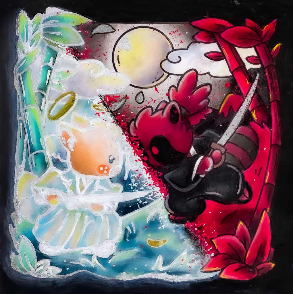
The image above is from Cozy Japan – Jade Summer.
Can you guess where I used light to dark, and where I used dark to light?
The Light To Dark Dilemma
Social media has brought up so many great artists and colorists. With our community, a lot of what you find is trend based. Color blending combos, tutorials for things like bricks, trees, knitwear, etc.
Coloring light, to dark, to light again is a byproduct of lack of confidence.
There, I said it. But lets break down the process here. Paper is a porous surface (or support). It isn’t a substrate that alcohol marker ink sits on top of.
It absorbs the alcohol solution and dye, the alcohol evaporates, and the dye and binding ingredients bind to the paper fibres.
A porous support + a wet medium = a stained paper.
When your paper is absolutely dry, it has the most power to absorb ink. So on the dark side of your subject, you need to get that dark value you into that paper, your midtones need that medium value, the highlights need your light value.
If you go over the entire area with your light tone, the paper is now saturated with your light tone. You’re going to be fighting that light tone where you’re supposed to be laying your dark tone the entire process.
BECAUSE… alcohol markers blend. Your dark tone will now be 2 tones lighter (like your midtone, or main color), your midtone color is now lightening close to the highlight color you chose.
So, you go back and darken the shadows again, and you go over the entire blend once more to define it. Your highlights are too dark now, so you need to try to use a colorless blender, or a white gel pen to show where they were supposed to be.
As this ink all sets in, can you remind me what the main color was that you chose?
The 3 Main Problems wtih Light To Dark Blending
The 3 main issues you’re facing here:
- You’ve lost the original color, focusing just on your shadows and highlights. Blending them, you weren’t paying attention to the actual color of the subject.
- You’ve wasted your ink. Light ink evaporates quickly and lifts color. Lighter alcohol markers are the quickest to dry out because the alcohol solution weighs less than the dyes added. To boot, when you’re using a color like Copic E0000, it’s easy to layer it to try and get something you can see. Once you’ve layered it 3x, you’re already at the next marker, Copic E000. When you are working with the lightest of alcohol markers – the trick is to remember to wait. The alcohol marker ink on the page is actually darker than the color, so they can come out grey at first. In 30 seconds or so once the alcohol marker ink evaporates, you’ll get a better tell at the saturation.
- When you are blending back and forth trying to get a smooth blend, the entire piece is just going to come out muddy. If you make the perfect gradient on an apple, a leaf, or a dress, its going to come out flat and muddled. Gradients don’t work in perfect blends.
When To Blend Light To Dark
I digress, it’s absolutely important to blend light to dark in many circumstances.
The most important times to remember the light to dark method include:
- Underpainting – I get more into this in my series about what underpainting is, but giving your entire area a wash of a similar color can help tie your colors in. I like to do this on things like gold, trees, and wood.
- Skin – Skin needs many layers and undertones. If you don’t use a consistent main color to bring these together, the warms and cools can look separated and mismatched. If you need an example of this – look at the portrait of me I’ve plastered all over the blog and my socials. I’m still super proud of that piece as a learning moment, but I needed to use a constant color to blend the shadow side into the rest of the image.
- Balloons – any harsh changes in color can make them look cartooney. Balloons are honestly one of the trickiest things to illustrate. Even perfectly done, you can figure out the illustrator’s process.
- Skies – I saved this one for last because it’s the most important time to use a light underlayer. The reason for this is that skies can be one of the toughest things to avoid streaks on. Using your lighter color underneath as you go (I even use colorless blender if I’m using a super light color) will keep the colors cohesive and even as you get the pigement down as fast as you can.
Can you see what the common theme in these things is? It’s a bit of a tough one.
It’s EVENNESS. You are aiming for balance, and using light to dark is a great way to help get you there.
For this picture, I had to go light to dark for the sky. I chose light to dark in order to try and get the glow around the moon as even as possible.
It didn’t matter how far outwards I shaded darker, because I knew the black would cover it. So, my focus was the thin ring around the moon.
The entire rest of the image, I shaded dark to light. I used a mix of hard shading (like the main bat’s wing, and the skeleton’s suit), and soft shading like along the carriage.
I left the bottom of the picture specifcially white in order to contrast the black sky. I used 5 markers total in this image.
The picture below is from Cozy Eras 2 – Jade Summer. I used Copic Sketch markers, Posca White, and Uniball Signo Gold.

Something I Noticed
While I was searching this topic over a year ago, I had a huge ‘aha’ lightbulb moment, because the topic is so 50/50.
The people who swear by and work exclusively dark to light – guess what their art background tends to lean to? Painting, fine art, and higher education art.
Now think about the order you use color when you’re using alcohol markers: When you use alcohol markers, you color in the exact opposite order that almost every other medium does.
Even our Copic value scale is backwards – 0 being the lightest and 9 the darkest. A proper value scale is 1 being the darkest, and 9 being the pure white.
You can’t really layer light on dark with alcohol markers, can you. So our brains tell us to work into that dark area as the final layer.
If you work with pastels, paints, or even photography, you work the opposite.
With painting – you use your darks to build form and shadow, adding over it until you add your highlights and whites last.
In photography and cinematography, you have a black scene and you “paint” it with your lights, diffusing and coloring them to create the shot.
So as alcohol marker colorists, we are being wired in a completely different way of looking at shading. THIS, is why it’s so important to use both.
When To Blend Dark To Light
- Snow. Fur. Clouds. If you are trying to lay your lightest tones down first, you’ve most likely already darkened your values too deep. It’s so much easier to get your shadows in and work into the midtones, keeping as far as you can from those highlights until last. The shadows (and sometimes midtones) on lighter subjects are also what make their form, so when you have a huge white space staring back at you, getting the form and shadows in are the only way to go.
- Hair. Curly, straight, dog, cat, llama, my left leg. Hair patterns need dark to light to pop. If you find yourself reaching for acrylic markers or white gel pens to make your hair stnad out, you needed to go dark to light, and keep the contrast higher.
- And unpopular opinion – but I don’t like doing flowers light to dark at ALL. I will explain this one in a full post and video. But flower gradients and colors are so light and delicate, that you want to almost always be coloring around the main area (where you’d useually have your midtone, or main colors). If I work in the shadows first, then go over those with my light color and blend it into the lightest areas, I almost always have a better time and more success.
- Anything small. If you’re coloring a small subject, you’re working with limited space to achieve a blend already. Why go and fill that with an offwhite pink before trying to establish a deep value? This goes for things like leaves (very much for leaves), stems, bricks, or anything that doesn’t have much space on your paper.
- Clothing – Clothes are either the easiest – or hardest things to color depending on how your brain works. For some people, the way clothes fall and fabric looks is second nature when they pick up an acohol marker, paint bursh, or colored pencil. I… do not have that eye. For me, skintones come like second nature without me needing to hesitate, but if you put a dress in front of me, I still struggle completely (like – to the point of shading it backwards to a reference photo, I reverse the colors). Clothing needs a high value contrast (very dark dark areas, very light lights, so going in with your dark areas first, then your light areas, then shading the dark out to the light is usually pretty fool proof (full video on this to come).
Should I Color Light to Dark or Dark to Light
Do you see why I was fine with giving up that answer at the beginning? You should absolutely never in any circumstance use a specific order methodically. Both absolutely have their purpose. Lets go back to the first sentence of this post for a second..
When you first picked up your alcohol markers and tried to blend two colors together, thinking about whether laying the dark color down or the light first was most likely not even a concept yet.
The order of operations wasn’t on your mind, how it made your subject look was.
That’s you, creating art.
If you’re hoping for a cohesive smooth look, light to dark usually wins. Powerful gradients and realistic shading – you should be learning dark to light.
I’m going to end this post with letting you know, especially as a new coloring artist – light to dark is MUCH more forgiving. It gives you a few extra chances to get the blend done right.
It’s super important for your coloring, as soon as you’re comfortable with blending – to challenge yourself to be using both orders of laying down your colors.

Bailey - Guy With Marker
Cat and frenchie dad, artist, film buff, and wine enthusiast. I'm here to build a community with artists from every step in their journey. Let's create together!